
Website Widget Connection
Summary
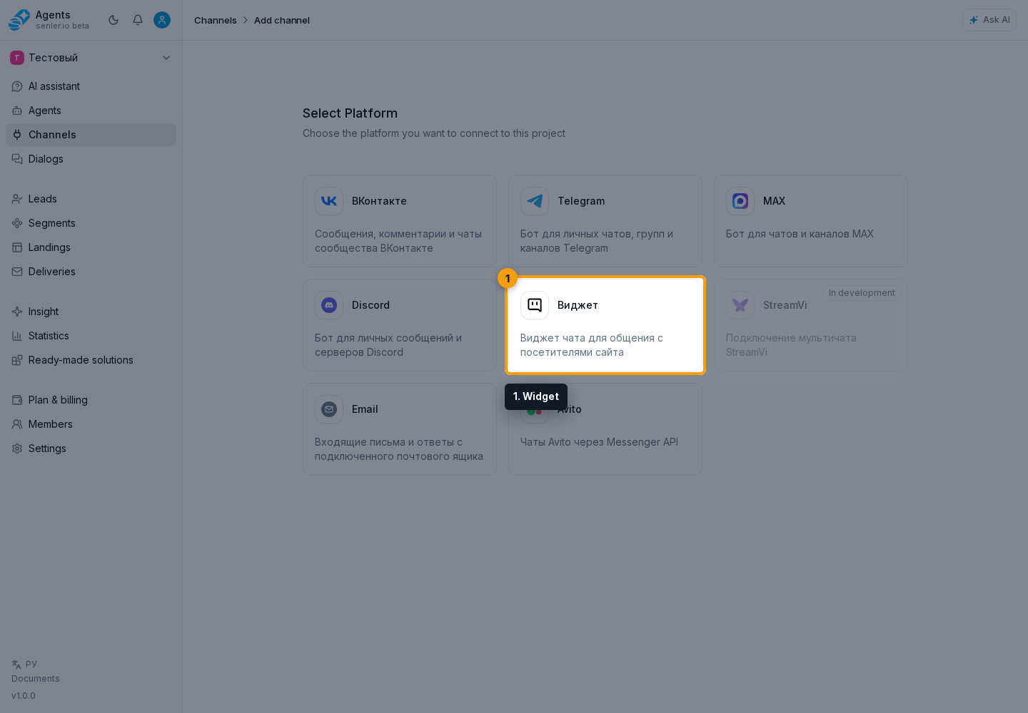
Path: Channels item in the side menu -> Add channel -> Widget.
Creation form
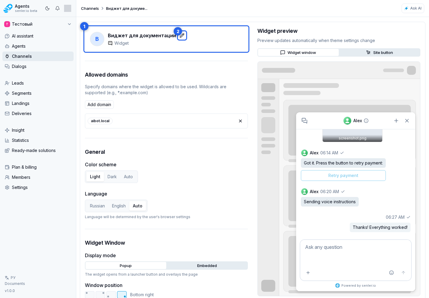
- enter the widget name;
- add allowed site domains with the add button;
- remove an unnecessary domain when needed;
- create the widget channel.
Domains
- you can specify a domain like
example.com; - you can use a mask like
*.example.com; - the domain is needed to limit the sites where the widget is allowed to work;
- the domain is added through "Add domain": in the opened window, enter the domain and click "Add";
- use the "Cancel" button in the add-domain window if you decide not to add the domain;
- an unnecessary domain can be removed from the list.
Channel Name, Icon And Domains
In widget channel settings, you can change the channel name, widget icon, and allowed domain list.
The name and icon affect how the channel appears in the cabinet and lists. To change the icon, first enable name editing: after that the icon area becomes available for file upload.
Allowed domains define which sites can run the widget code. If the site is opened on a domain that is not in the list, the widget may not start or may not accept the connection.
After creation
- the cabinet shows the widget code;
- the code must be inserted into the site before the closing
</body>tag; - then you can open the widget settings and customize the appearance.
Widget settings
- channel name;
- icon;
- allowed domains;
- color scheme: light, dark or auto;
- language: Russian, English or auto;
- display mode: popup window or embedded widget;
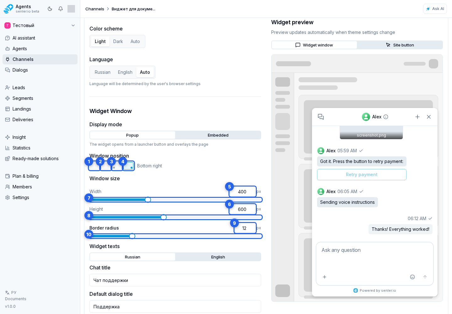
- popup window position: top left, top right, bottom left or bottom right;
- window width from 200 to 800;
- window height from 300 to 1000;
- rounding radius from 0 to 50;
- shadow;
- texts in Russian and English;
- button settings;
- chat function settings;
- embed code.
Window And Appearance
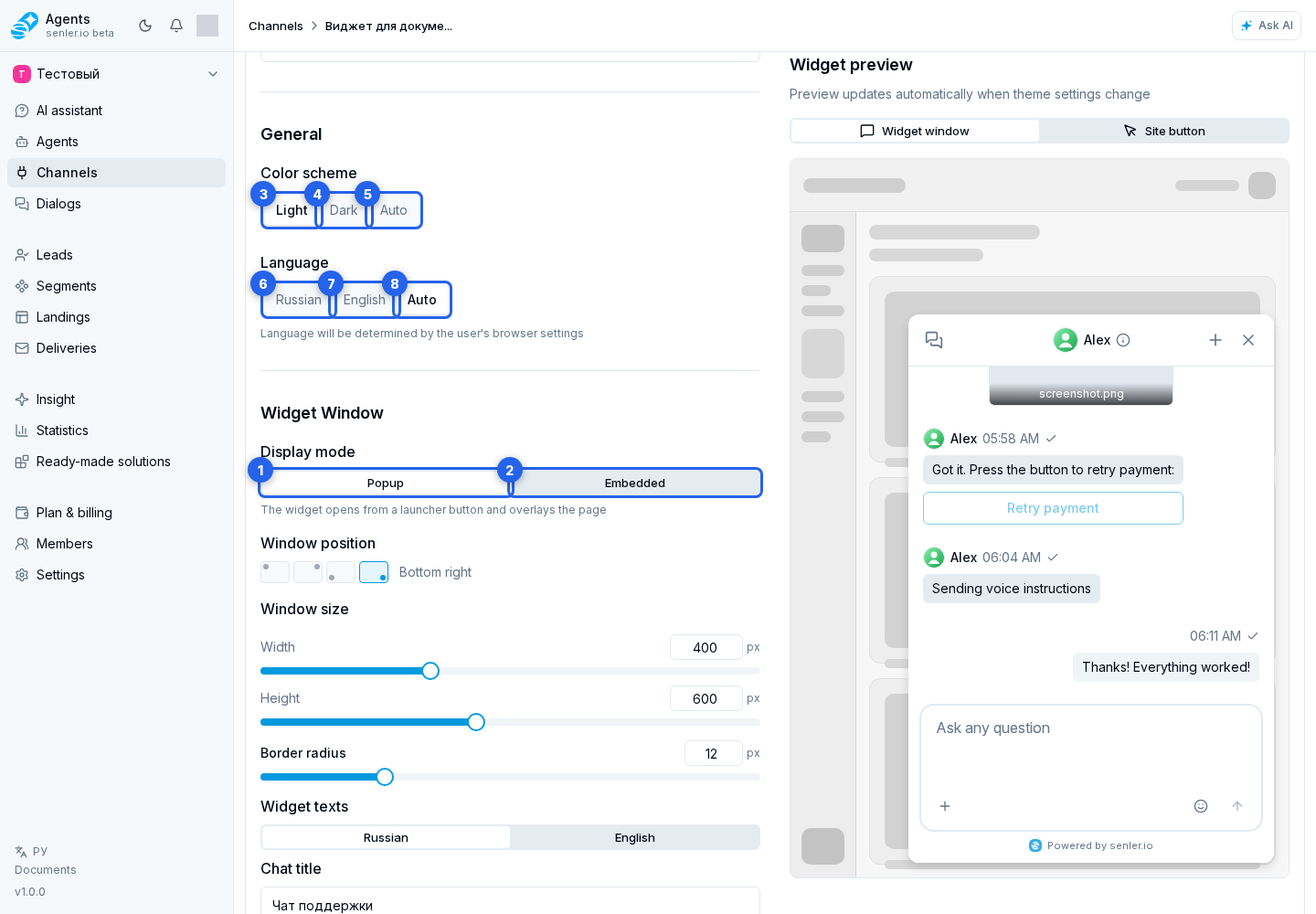
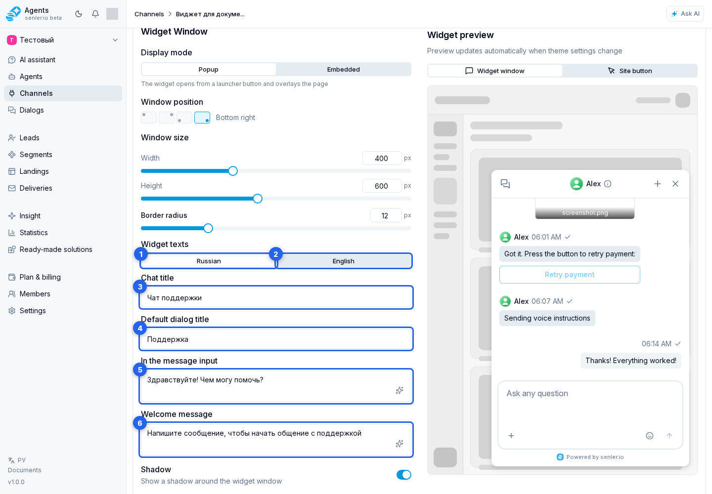
Display mode defines how the widget appears on the site:
- "Popup" - the widget opens from a floating button and shows a window over the page;
- "Embedded" - the widget is embedded into a page container without a floating button.
For the popup window, you can choose window position, width, and height. Width is limited to 200-800 px, height to 300-1000 px. Enter an exact value in the numeric field, or use the width slider and height slider for visual adjustment. Corner radius is set separately and works for both popup and embedded modes; it can also be changed with the radius slider. The "Shadow" switch enables or disables the shadow around the window.
Color scheme sets light, dark, or automatic mode. In automatic mode, the widget follows the user's browser settings. Widget language can be selected explicitly or left as "Auto".
Rounding changes immediately in preview but is saved only after the save button is clicked. With dynamic code, the saved border_radius is loaded from the server. With static code, replace the code on the site after saving. To change an already running instance temporarily, a developer can call SenlerWidget.updateRuntime({ border_radius: 18 }); this value is not written to channel settings.
Widget texts
- chat title;
- standard dialog title;
- input field hint;
- welcome message.
Texts are configured separately for Russian and English. The language tab in the "Widget texts" block changes only the text version being edited, not the overall widget language.
"Chat title" is shown in the widget window header. "Default dialog title" is used while the dialog has no custom title. The "In the message input" field controls the text the user sees in the input line before typing. "Welcome message" is shown in an empty chat before the first message.
Widget Button
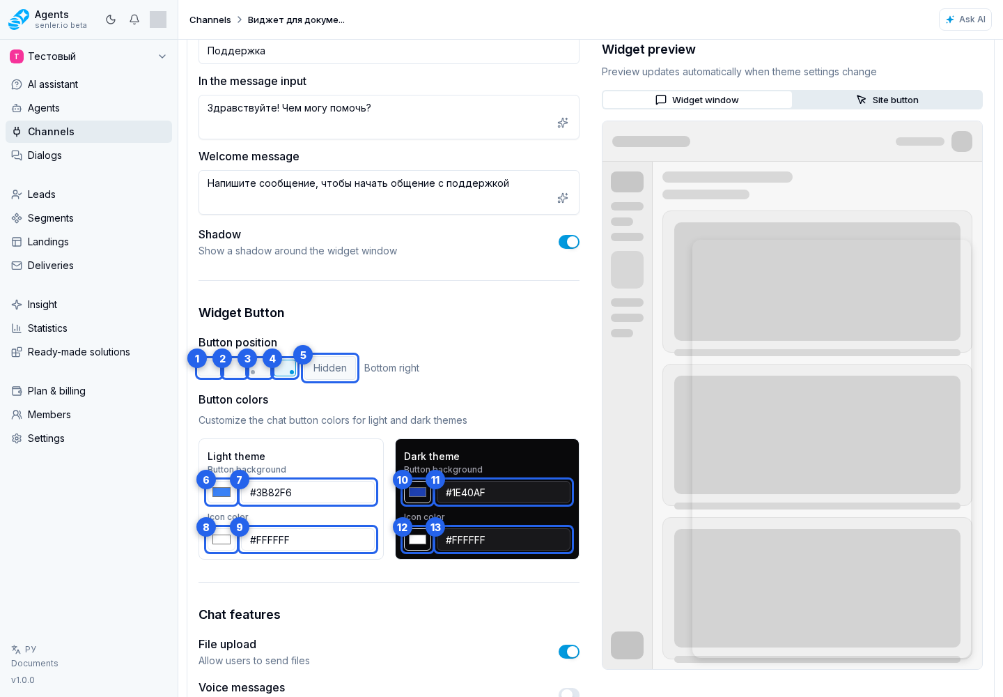
- position;
- background color for light/dark theme;
- icon color for light/dark theme.
The widget button exists only in "Popup" mode. It can be placed in one of four corners or hidden. If the button is hidden, the widget can only be opened programmatically from the site.
Button colors are set separately for light and dark themes: button background and icon color. Choose a color from the palette or enter an exact HEX value in the adjacent field.
Closing And Collapsing
In popup mode, the close button is already available in the widget header, so you do not need to add it separately. SenlerWidget.close() hides the window, and SenlerWidget.open() shows it again.
In embedded mode, the regular close button is hidden. A developer can enable a collapse button inside the header with shell.collapse_button: true. Clicking it calls onCollapse(detail) and dispatches senler-widget:collapse-request, but does not hide the widget automatically. The site chooses one handler and calls SenlerWidget.close() or closes its outer panel. SenlerWidget.open() shows the hidden wrapper again. A complete example is available in the Public API guide.
SenlerWidget.destroy() is not a collapse operation: it completely removes the instance, so another initialization is required.
Chat features
- file upload;
- voice messages;
- emoji;
- split view of the dialog list and chat;
- chat history in the widget header;
- chat history search;
- page element selection.
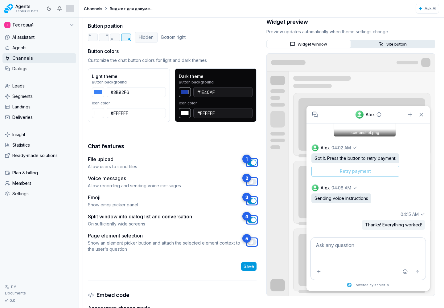
Switches in the "Chat features" block control what the site user sees:
- "File upload" allows sending files through the widget;
- "Voice messages" enables recording and sending voice messages;
- "Emoji" shows the emoji picker;
- "Split window into dialog list and conversation" shows the dialog list next to the selected chat on sufficiently wide screens;
- "Page element selection" shows the element picker button and sends the selected site place together with the user's question.
Preview And Saving
- the window preview shows how the widget will look on the site;
- the button preview shows the floating chat launch button;
- on a mobile screen, the "Widget", "Button", and "Settings" tabs switch between the window preview, button preview, and settings form;
- after changing settings, click the save button.
The preview helps check theme, dimensions, rounding, texts, and colors before updating the widget on the site. It shows the current draft immediately but does not save it. With static code, save, copy the new code, and update it on the site. With dynamic code, saved changes are applied from the server automatically.
Chat history in the widget
All visitor-facing controls and states are described separately in Website Widget Interface.
- if the site user already has dialogs, the widget may automatically open the current dialog on first entry;
- a chat history button is available in the chat header;
- the history menu can open the full chat list, create a new dialog, or find a dialog through search;
- history search starts from two characters;
- unread messages are shown as a counter on the dialog.
Embed code
- can be static or dynamic;
- if the user changes the settings, you need to update the code on the site if static code is used;
- with dynamic code, changes are applied automatically.
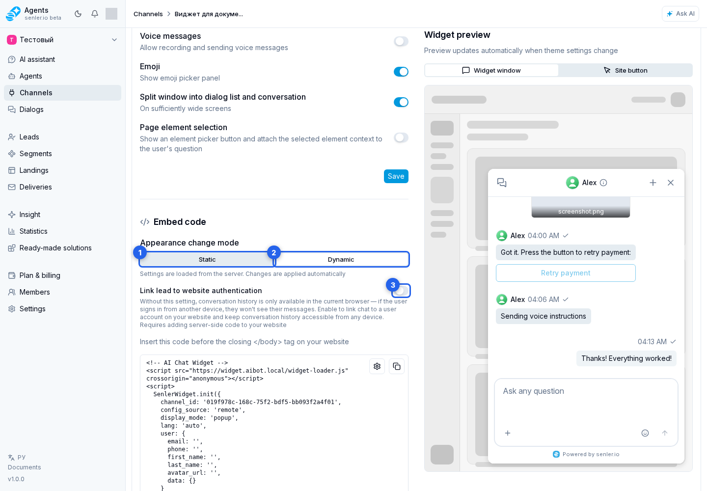
Appearance change mode selects how the site receives settings:
- "Static" - settings are embedded directly into the code. After changing appearance, copy the new code and update it on the site;
- "Dynamic" - the site loads settings from the server. Changes apply without replacing the code if the code itself is already installed correctly.
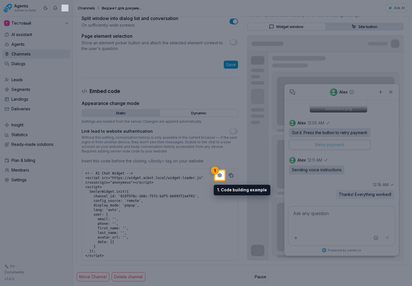
The ready embed code is read-only. Change the settings above, wait for the code to refresh, and use the copy button. The gear button opens an example where you can build code with user data.
Code Building Example
In the code building example, you can add user data: email, phone, first name, last name, avatar URL, and additional user.data parameters.
Selecting fields in the example does not change the main generated code in settings. Additional parameters are passed as key-value pairs. They are used for personalization and context: tariff, city, current site section, traffic source, or other data that helps the operator and agent better understand the user.
The result appears immediately in the example preview field. Check the selected data, then copy the code with its separate button.
Opening The Widget And Site Context
This section is for the site developer when the site should open the widget itself, pass a message, pass current page data, or show site actions in the chat. If you only change the widget appearance in the cabinet, you can skip this section: save the settings and update the code on the site when static mode is used.
After installing the code, the developer can use additional widget capabilities:
- initialize the widget once on the site after installing the code;
- open, close, or toggle the popup or embedded wrapper from a site event;
- show a collapse button in an embedded widget and handle the collapse request on the host site;
- select an existing dialog without sending a new message;
- open the widget immediately with message text or context for the next question;
- pass persistent context for the current page, card, order, or project;
- update context, message, or available actions without reinstalling the widget;
- temporarily change
theme_mode,border_radius,display_mode, andshellparameters throughupdateRuntime; - declare site actions through
customActions, so the agent can show a button in the chat and the site performs the action on its side; - connect an AI text-edit scenario in a site field: the site shows its own UI, while the widget creates the dialog and returns the edited variant;
- set the language of site action descriptions through
customActionsLanguageif they are written only in Russian or only in English; - remove the widget from the page if the site manages the widget lifecycle itself;
- link the chat to an authorized site user through
external_idanduser_hash.
Action names and passed data should be clear to the user and operator. If you need to pass the current page without manual element selection, use page context. If you need to let the agent perform an action on the site, use site actions.
Detailed methods, parameters, and examples are in the site developer instructions.
Important To Remember
- the floating button can be hidden, but the widget window itself cannot be hidden this way;
- if you need to remove the button from the site, choose the "Hidden" button position;
- embedded mode does not use the floating button;
close()hides the current wrapper without losing the instance, whiledestroy()removes the widget completely;- the
shell.collapse_buttonbutton only requests collapsing, so the site must handleonCollapseorsenler-widget:collapse-request.
Linking To An Authorized User
- needed to link a site user to an authorized account;
- includes a secret key;
- the secret can be shown, copied or regenerated;
- regenerating the secret is dangerous: the old key stops working immediately;
- if linking to authentication is enabled,
external_idanduser_hashare needed in the code; - in the code example you can specify email, phone, first name, last name, avatar and additional data fields.
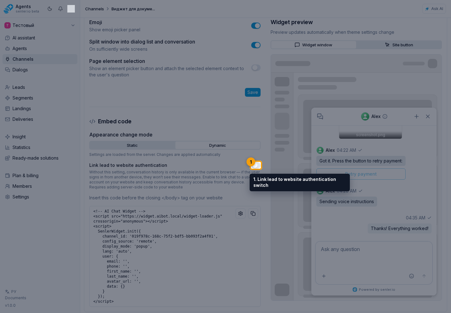
The Link lead to website authentication switch is needed when the user should see conversation history after signing in from another device or browser. Enabling it requires the site developer: the site must pass the user's external ID and user_hash signature.
Keep the secret key only on the site server. You can show or hide it, copy it, or regenerate it. Regeneration immediately disables the old key, so prepare the server update first. In the confirmation dialog, you can cancel the replacement or confirm it.
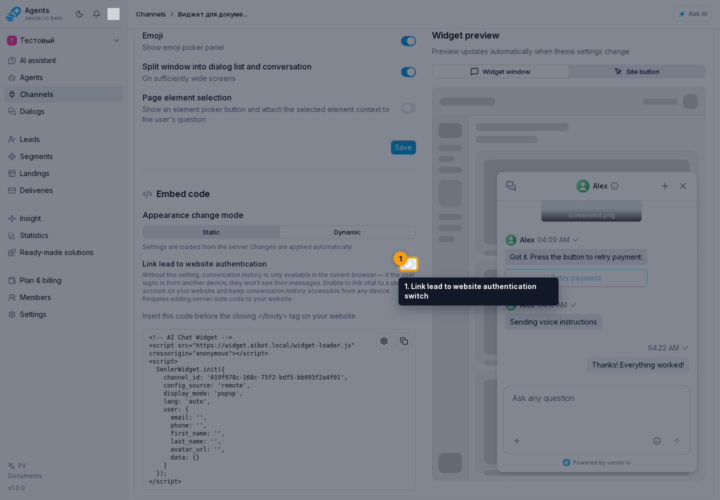
If linking is enabled, the cabinet shows server-side code examples for signature generation. Select the example language and copy the required snippet.
Element selection
- is enabled with the "Page element selection" switch in chat feature settings;
- sends the context of the selected place on the site with the message;
- helps the agent understand which button, field, card, or page block the user is asking about;
- usually it is enough to add clear labels to important site elements without a separate app change;
- see site element markup for details.
If the widget is not displayed on the site
- check whether the code is inserted into the site;
- check the allowed domain;
- check if the script is blocked by site policy;
- check the widget display mode;
- check the browser console;
- check the agent's purpose and channel status.
Where this is in the interface
Main elements in this section:
- channel list
- Channels item in the side menu
- Add channel button
- Widget platform selection button
- channel settings page
- widget settings area
- widget name edit button
- widget name field
- widget name save button
- cancel widget name editing button
- widget icon
- add allowed domain button
- allowed domain field
- confirm domain addition button
- cancel domain addition button
- remove allowed domain button
- widget button position: bottom left
- widget button position: bottom right
- widget button position: hidden
- widget button position: top left
- widget button position: top right
- widget button background in light theme
- light-theme button background palette
- button icon color in light theme
- light-theme button icon palette
- widget button background in dark theme
- dark-theme button background palette
- button icon color in dark theme
- dark-theme button icon palette
- widget window preview tab
- site button preview tab
- mobile widget window tab
- mobile site button tab
- mobile widget settings tab
- display mode: popup
- display mode: embedded
- widget language: auto
- widget language: English
- widget language: Russian
- widget theme: auto
- widget theme: dark
- widget theme: light
- widget window position: bottom left
- widget window position: bottom right
- widget window position: top left
- widget window position: top right
- widget window width
- widget window width slider
- widget window height
- widget window height slider
- widget corner radius
- widget corner radius slider
- widget window shadow switch
- Russian widget texts tab
- English widget texts tab
- chat title in Russian
- chat title in English
- default dialog title in Russian
- default dialog title in English
- input text in Russian
- input text in English
- welcome message in Russian
- welcome message in English
- file upload switch
- voice messages switch
- emoji switch
- dialog list and chat split view switch
- page element selection switch
- widget settings save button
- static widget code mode
- dynamic widget code mode
- lead link to website authentication switch
- ready widget embed code
- open code building example button
- copy widget code button
- show or hide secret key button
- copy secret key button
- regenerate secret key button
- cancel secret key regeneration button
- confirm secret key regeneration button
- server-side signature example tab
- copy server-side signature example button
- email field in the code building example
- phone field in the code building example
- first name field in the code building example
- last name field in the code building example
- avatar URL field in the code building example
- additional user.data parameters in the code building example
- additional user.data parameter key
- additional user.data parameter value
- add additional user.data parameter button
- remove additional user.data parameter button
- code building example preview field
- copy code building example button