
Website Widget Interface
Window and header
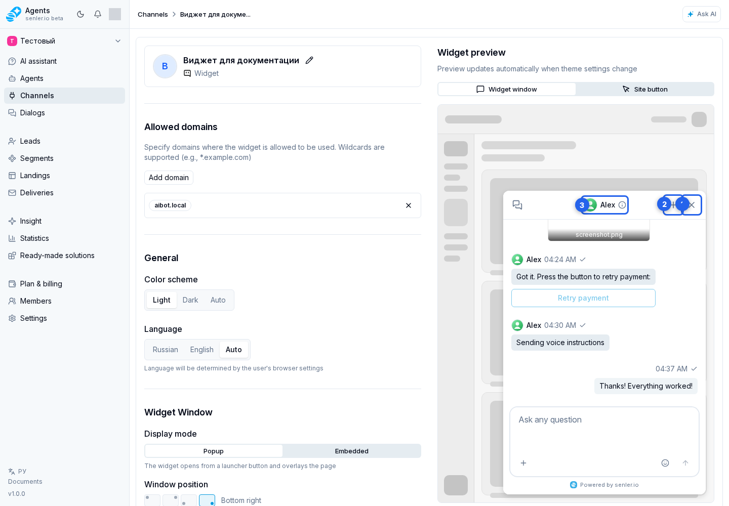
A visitor opens a popup through the widget button and closes it with the header close button. While the window is loading, a frame close button is available. Embedded mode does not show the regular close button: the site can enable a close-shaped collapse button inside the header. Clicking it only tells the site that the user wants to collapse the widget; the site then hides the wrapper or its outer panel. Back returns to the previous screen.
The header lets the visitor start a new dialog, change language, open user details, and copy the dialog ID. When the interface version is outdated, refresh version reloads the widget.
Dialogs and search
In an open chat header, the history button opens a compact list over the conversation. In it, search filters conversations and a dialog row opens the selected chat.
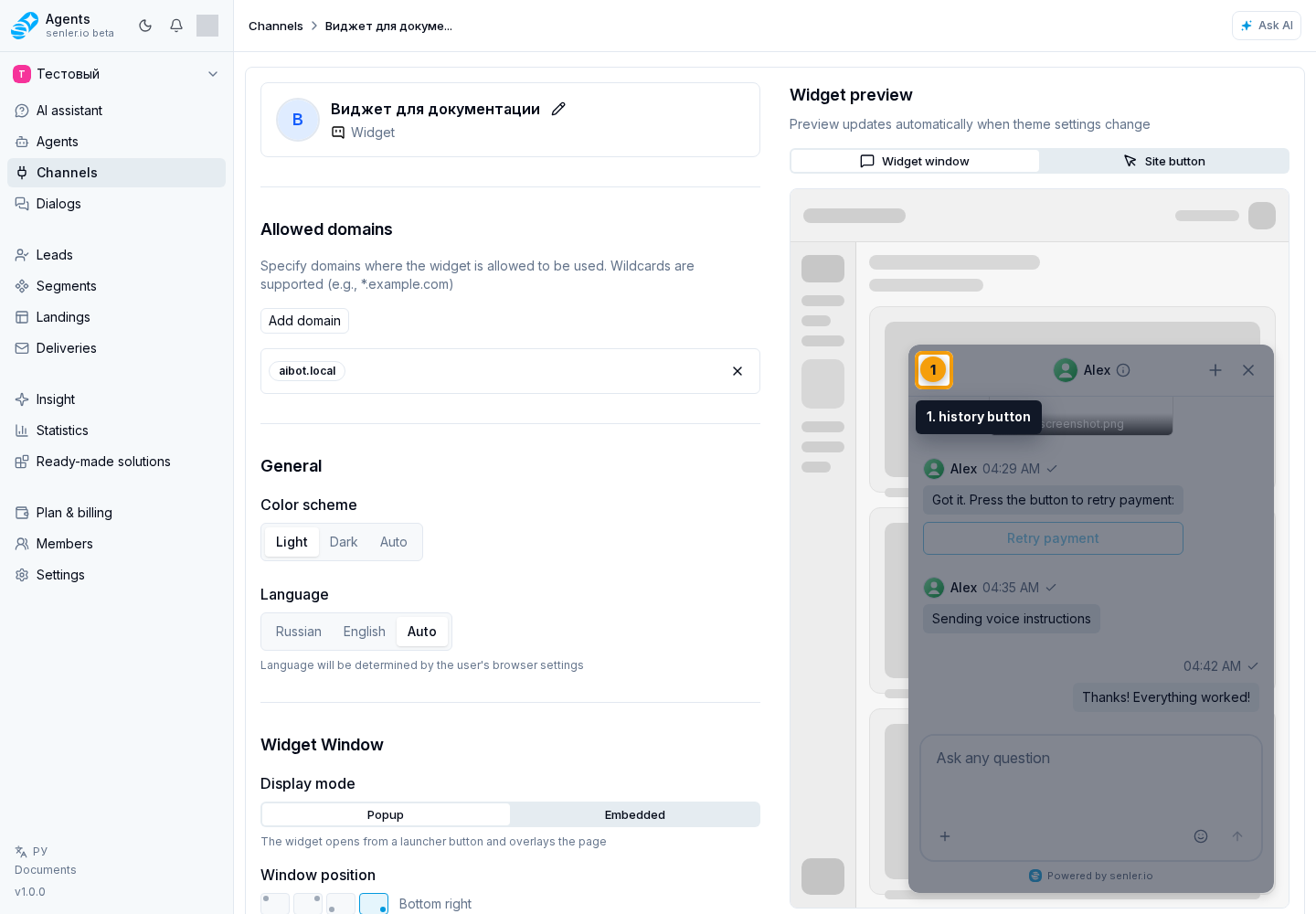
On the separate history screen, Back returns to the list. In the full list, each dialog opens its conversation. Search finds a dialog by available text, while clearing the field restores the full list. When search finds nothing, use clear search; when no dialogs exist yet, use create the first dialog.
If the list fails to load, retry loading dialogs requests the data again.
In the chat, dialog information shows its details. In embedded history, enter a quick message in the message field and send it.
Message and reply
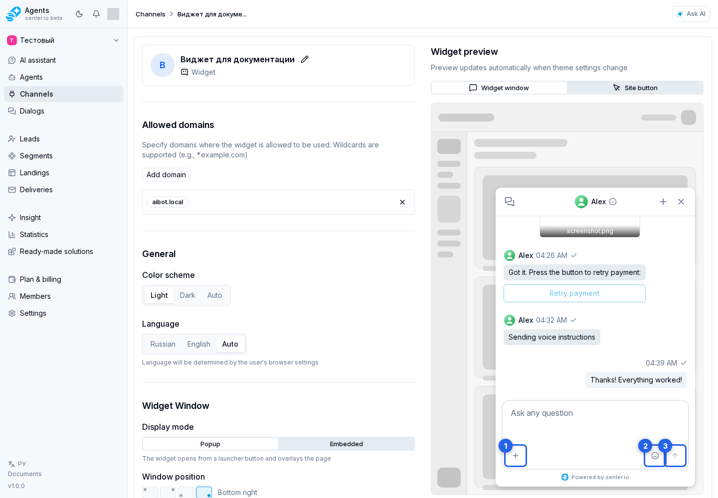
The composer offers attachments, voice recording, emoji, and send message. If page element selection is enabled, select element attaches the relevant place on the site to the question.
When replying to a specific message, its source preview scrolls the chat to that message. You can also go to the message or cancel the reply.
An agent message can show action buttons. Depending on its configuration, a button opens a link, passes a custom action to the host website, or submits the selected answer to the dialog. While a button response is being processed, the other buttons on that message are temporarily disabled to prevent duplicate actions.
A button in the top-right corner of a formatted code block copies all of its code. It briefly shows the result after it is clicked. Long lines wrap for reading but are copied in their original form.
Attachments
For a prepared attachment, you can open the image or remove the file before sending. Audio offers play and pause and remove.
In history, images open through view image, video through view video, and stickers through view sticker. Open recognition results through attachment information; Back returns to the message.
Viewing and errors
The image viewer offers zoom in, zoom out, reset zoom, and close. Video has a separate close button.
During startup, dialog loading, and message loading, the widget shows the current action so an empty screen is not mistaken for a ready state. While connecting, it may show “Establishing connection…” or “Restoring connection…”. The widget keeps retrying automatically and returns to the chat after recovery.
When connection is lost, connection details explain the state. Copy for support copies diagnostic details that can be shared without manually transcribing errors. It can appear for different stages:
- creating a new dialog;
- initial dialog list loading and its background refresh;
- loading the list in the history menu, refreshing it, and sending a quick message from history;
- initial message loading in the open chat and its background refresh;
- sending a message, uploading an attachment, and receiving a streamed response.
A general error can be retried or fixed with reload. If the interface itself fails during startup, the widget also offers retry or reload.
Dismiss sending, streaming, upload, and voice errors through send error, response error, upload error, and recording error.
If the open chat history fails to load, retry loading history restores messages without creating a new dialog.