
Website Widget Interface
Window and header
This article explains how to use an installed widget. If you are setting it up for your website, start with channel connection and settings. The buttons available to visitors depend on the site owner's settings.
Select the widget button on the website to open the popup. The header close button closes it. To start a new dialog, select the plus in the header: an empty chat opens. The new dialog is saved after its first message is sent.
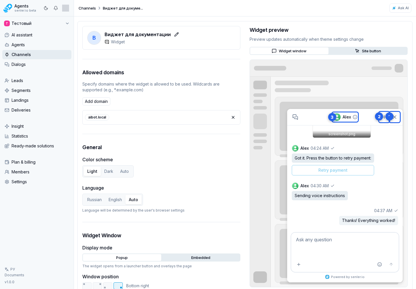
If an information icon appears next to the header title, select it to open user details. In this popover, you can change language and, for an existing dialog, copy the dialog ID, for example when contacting support. These actions are inside the information popover, not separate header buttons.
When a new version is available, an Update available warning appears nearby. Select it, read the explanation, and choose Refresh to reload the widget.
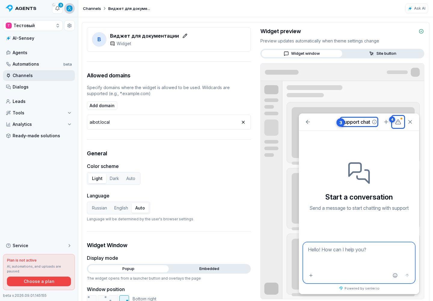
While the popup is loading, you can close it using the frame close button. A widget embedded directly in the page has no regular close button. The site owner can add a collapse button; how the widget is hidden after it is clicked is configured on the website itself. On screens where Back is available, it returns to the previous screen.
Message and reply
Type your question in the message field at the bottom of the chat.
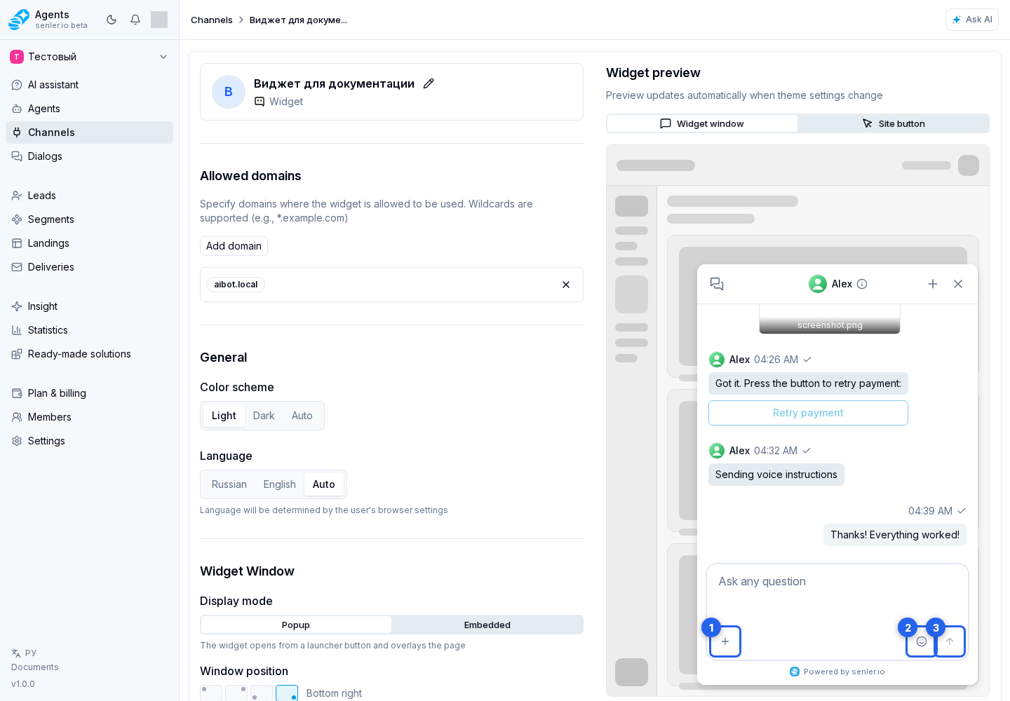
If the site owner enabled these features, the nearby buttons offer attachments through the plus, voice recording through the microphone, and emoji through the smiley. If page element selection is enabled, select element lets you indicate which part of the website your question refers to.
When the message is ready, select the send arrow. From the keyboard, use Ctrl+Enter on Windows and Linux or Cmd+Enter on macOS.
Before a conversation starts, buttons with ready-made questions may appear below the welcome message. The widget uses the set for its current language. Clicking a button immediately sends its text as the visitor's message; the active button shows sending progress and the others stay disabled until it finishes. If none of the options fit, the visitor can type a custom message as usual.
While the agent prepares a response, the widget can show a safe work stage: “Thinking…”, “Searching for information…”, “Working with an external service…”, “Analyzing an attachment…”, “Creating an image…”, “Creating audio…”, “Preparing the result…”, “Preparing an attachment…”, “Performing an action…”, or “Finalizing the response…”. These labels do not expose tool requests, tool results, or the agent's internal reasoning.
You can keep the regular “Agent is typing” status instead of stages or hide the indicator completely. Select the option under agent tools in the What to show while processing field. A separate Show response while it is being generated toggle controls the progressive appearance of response text and does not replace this setting.
When replying to a specific message, its source preview scrolls the chat to that message. You can also go to the message or cancel the reply.
The widget respects the stored format of each message. A Markdown message renders headings, lists, links, quotes, tables, and code blocks. Plain text preserves line breaks but shows Markdown characters literally. Text containing asterisks or hash signs therefore does not become formatting when its source sent it as plain text.
An agent message can show action buttons. They preserve the order and row grouping configured in the automation. Their styling distinguishes neutral, primary, confirming, and warning actions. Depending on its configuration, a button opens a link, passes a custom action to the host website, or submits the selected answer to the dialog.
While a button response is being processed, the other buttons on that message are temporarily disabled to prevent duplicate actions. If repeated clicks are disabled for an answer option, it remains unavailable after its answer has been accepted. Links continue to open regardless of this setting. Custom actions that the site allows to run automatically are not shown in the message: the widget runs them through the site's handler without another click.
A button in the top-right corner of a formatted code block copies all of its code. It briefly shows the result after it is clicked. Long lines wrap for reading but are copied in their original form.
Attachments
For a prepared attachment, you can open the image or remove the file before sending. Audio offers play and pause and remove.
In history, images open through view image, video through view video, and stickers through view sticker. Open recognition results through attachment information; Back returns to the message.
Dialogs and search
To return to an earlier conversation, select the history button on the left of the open chat header.
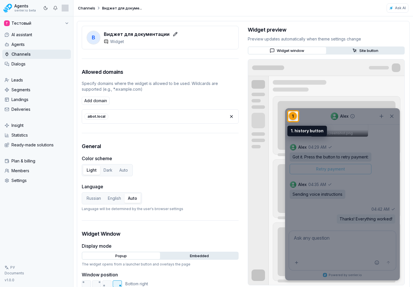
A compact list over the conversation opens. If there are many dialogs, use search: enter at least two characters. Select the matching dialog row to open the conversation.
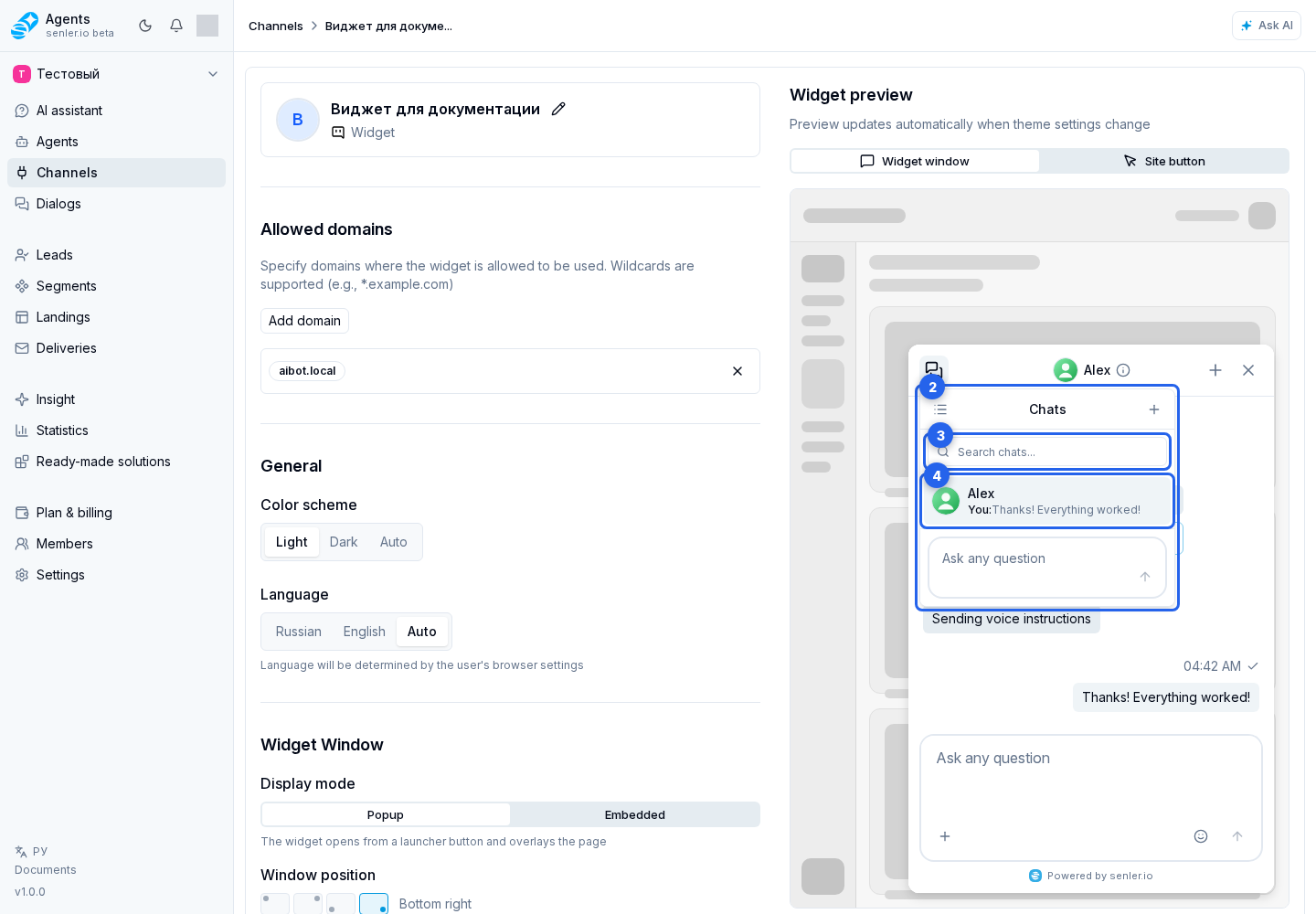
To open the full dialog list, select the list icon to the left of the Chats title in this menu. On the screen that opens, select a dialog or use search. Clearing the field restores the full list. If there are no matches, use clear search; if there have been no conversations yet, use create the first dialog.
If the list fails to load, retry loading dialogs requests the data again.
Credit limit
When a personal limit applies to the visitor:
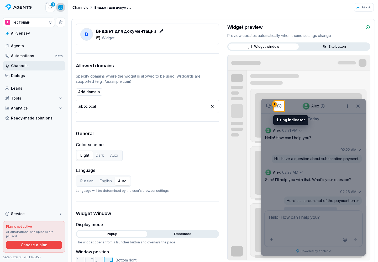
- Select the ring indicator in the header. It shows the percentage of available credits.
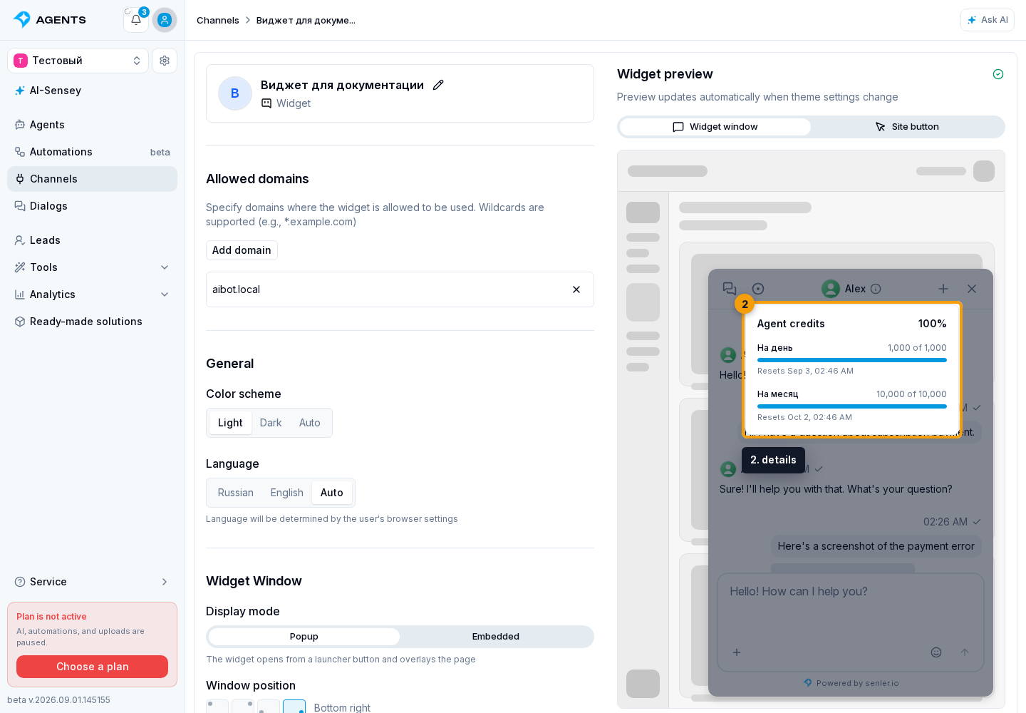
- Review the details: for each period, they show the remaining amount, total limit, and reset time. If the lead received extra credits, their remaining amount and the total available amount appear below. The percentage in the header accounts for the period that will restrict the next agent run first and for extra credits.
When the available amount is exhausted, the input is replaced with Credits used up. A new message in this dialog no longer starts the agent until a period resets or the lead receives extra credits.
If the widget owner enabled a top-up offer, the visitor can select Add credits. This button only notifies the website about the request: the site owner handles payment and the subsequent credit grant. If the channel allows external AI, Connect your AI may appear next to it.
The rules are described in Lead credit limits. The purpose of both buttons and the distinction between them are covered in Visitor credit limit, handling Add credits is covered in the Widget Public API, and AI client connection is covered in Use via MCP.
Viewing and errors
The image viewer offers zoom in, zoom out, reset zoom, and close. Video has a separate close button.
During startup, dialog loading, and message loading, the widget shows the current action so an empty screen is not mistaken for a ready state. While connecting, it may show “Establishing connection…” or “Restoring connection…”. The widget keeps retrying automatically and returns to the chat after recovery.
When connection is lost, connection details explain the state. Copy for support copies diagnostic details that can be shared without manually transcribing errors. It can appear for different stages:
- initial dialog list loading and its background refresh;
- loading the list in the history menu and refreshing it;
- initial message loading in the open chat and its background refresh;
- sending a message, uploading an attachment, and receiving a streamed response.
A general error can be retried or fixed with reload. If the interface itself fails during startup, the widget also offers retry or reload.
Dismiss sending, agent response, upload, and voice errors through send error, response error, upload error, and recording error. If response preparation ends with an error, the processing indicator disappears and the widget reports that the agent response could not be received; a stage that keeps running is not a final answer.
If the open chat history fails to load, retry loading history restores messages without creating a new dialog.