
Widget appearance
Configure the widget window, texts, and button in channel settings. These values are used on websites where this widget is installed.
Main section: Widget.
Window And Appearance
Display mode defines how the widget appears on the site:
- Popup - the widget opens from a floating button and shows a window over the page;
- Embedded - the widget is embedded into a page container without a floating button.
For a popup, choose its position: top left, top right, bottom left, or bottom right. Width is limited to 200-800 px and height to 300-1000 px. Enter an exact value in the numeric field, or use the width slider and height slider for visual adjustment. Corner radius works for both popup and embedded modes; it can also be changed with the radius slider. The Shadow switch enables or disables the shadow around the window.
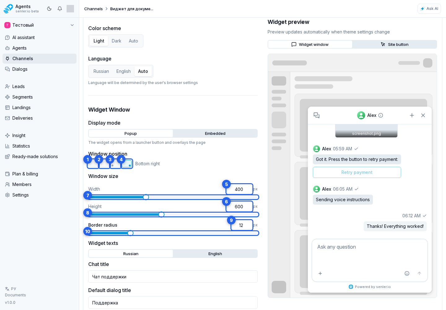
Color scheme sets light, dark, or automatic mode. In automatic mode, the widget follows the user's browser settings. Language can be set to Russian, English, or Auto.
Click the gear to the right of the color scheme options to open Widget colors. Each theme has two colors:
| Theme | Window background | Accent color |
|---|---|---|
| Light | Background HEX code or background picker | Accent HEX code or accent picker |
| Dark | Background HEX code or background picker | Accent HEX code or accent picker |
Enter a color as #RRGGBB or choose it in the picker. The accent is used for active elements, buttons, and highlights. Surface, border, and text shades are selected automatically. An empty field keeps the default color; without custom colors, the default appearance stays unchanged. In Auto mode, the widget uses the colors of the matching browser theme.
The Default colors button resets the light or dark theme separately. Click Apply to see the colors in the preview, then save the widget settings with the main save button. Cancel closes the dialog without applying changes. Colors of the floating site button are configured separately.
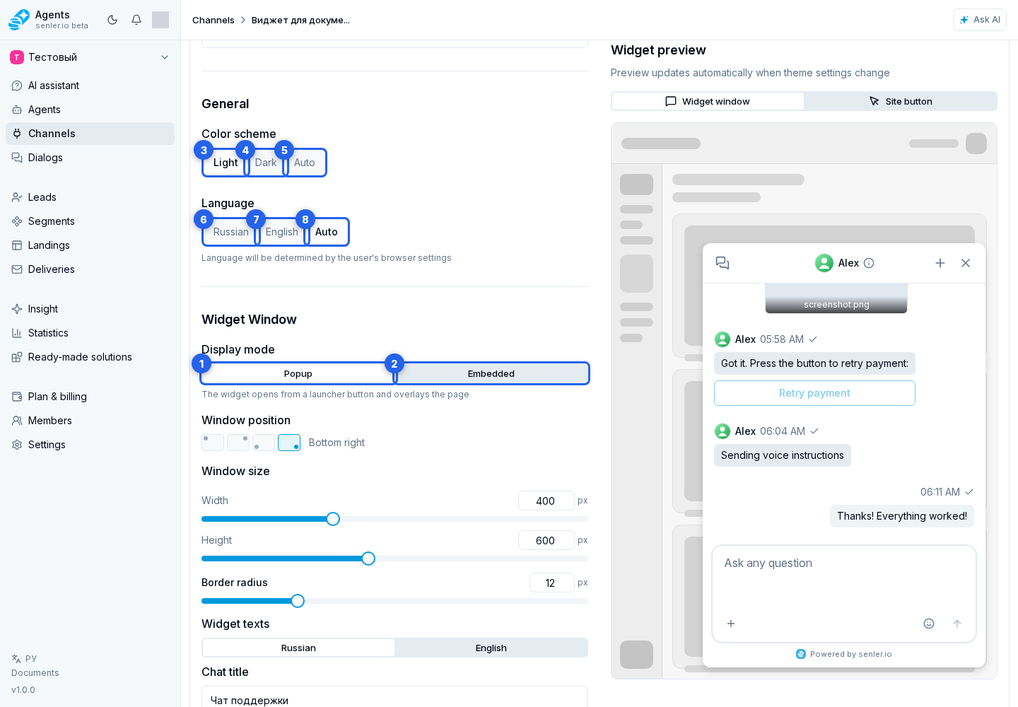
Rounding changes immediately in preview but is saved only after the save button is clicked. The saved border_radius applies on the next widget initialization unless the site overrides it through init. To change an already running instance temporarily, a developer can call SenlerWidget.updateRuntime({ border_radius: 18 }); this value is not written to channel settings.
Welcome screen icon
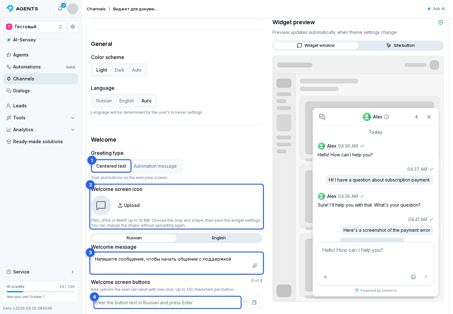
For this layout, select Centered text in greeting settings.
In Welcome screen icon, you can replace the default icon above the greeting with your logo or image:
- Click Upload and choose a PNG, JPEG, or WebP file up to 10 MB, no larger than 8000 pixels on either side.
- In Customize the welcome icon, move and zoom the image to select the area you need. Choose Circle or Square.
- Click Apply, then save the widget settings. Cancel closes the dialog without replacing the image.
The image is used in Centered text mode before a dialog is selected and in an empty chat. It does not change the channel icon, message avatars, or floating button. You can switch an uploaded image between circle and square without uploading it again. To restore the original icon, click Default icon and save the settings.
To configure it from site code, use the welcome image parameters. The URL and shape explicitly set in init take priority over channel settings.
Widget texts
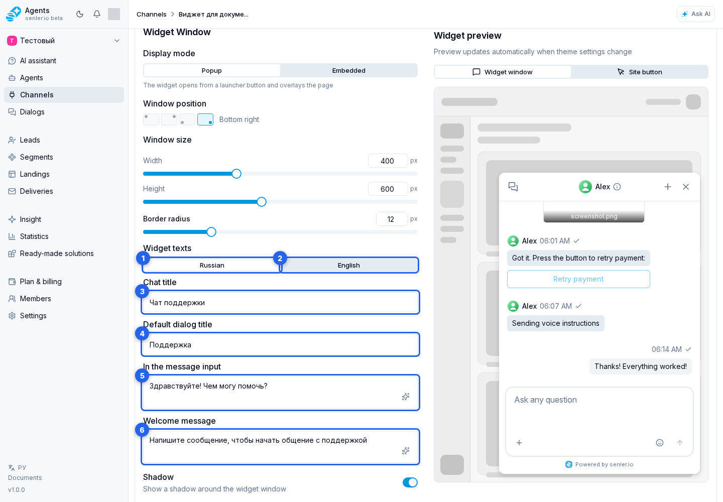
Texts are configured separately on the Russian and English tabs. A tab changes only the text version being edited, not the overall widget language.
On the Russian tab, set the chat title, default dialog title, and input placeholder. The English tab provides the same fields: chat title, default dialog title, and input placeholder.
The chat title is shown in the widget header. The default dialog title is used until a dialog has its own title. The placeholder is visible before typing.
Edit the greeting separately: choose Centered text in the Greeting block. On the RU tab, set the welcome message and add buttons with first-question options in the Russian field below. On the EN tab, set the welcome message and buttons in the English field.
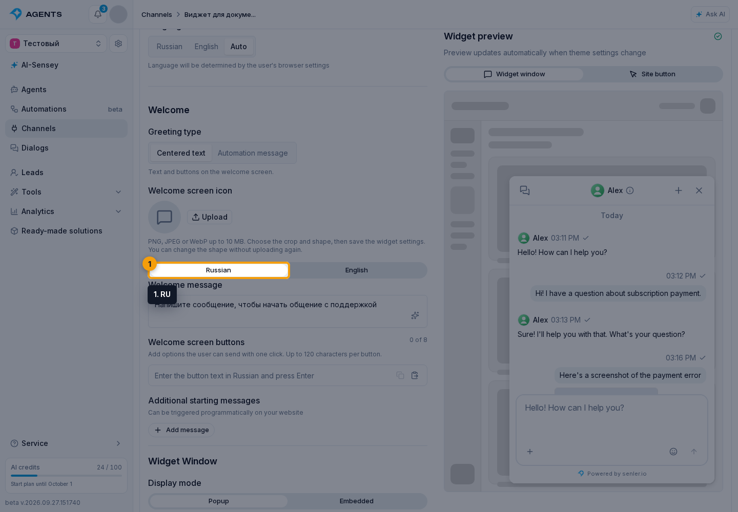
Each language accepts up to 8 unique buttons, each no longer than 120 characters. The widget shows only the list for its current language; if that list is empty, no buttons appear.
Visitors see these options below the welcome message before the conversation starts. Clicking one immediately sends its text as the visitor's message. While it is being sent, the other options are temporarily disabled to prevent duplicate requests.
Widget Button
Button Position
The widget button exists only in Popup mode. Place it at the top left, top right, bottom left, bottom right, or hide it. If the button is hidden, the widget can only be opened programmatically from the site.
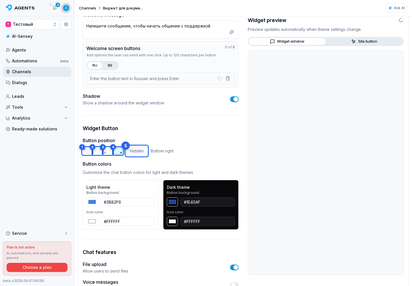
Button Colors
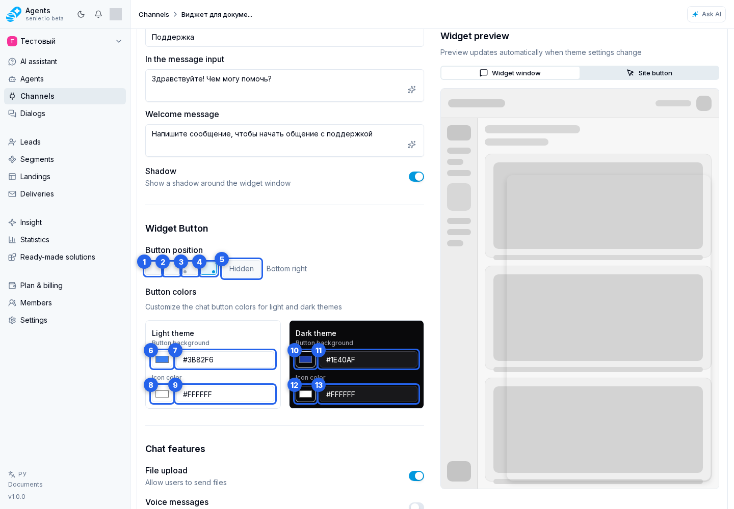
For the light theme, choose the background in the palette and refine it in the HEX field when needed, then set the icon color in the palette and its HEX field. For the dark theme, use the background palette, background field, icon palette, and icon field.
Closing And Collapsing
In popup mode, the close button is already available in the widget header, so you do not need to add it separately. SenlerWidget.close() hides the window, and SenlerWidget.open() shows it again.
In embedded mode, the regular close button is hidden. A developer can enable a collapse button inside the header with shell.collapse_button: true. Clicking it calls onCollapse(detail) and dispatches senler-widget:collapse-request, but does not hide the widget automatically. The site chooses one handler and calls SenlerWidget.close() or closes its outer panel. SenlerWidget.open() shows the hidden widget again. A complete example is available in the Public API guide.
SenlerWidget.destroy() is not a collapse operation: it completely removes the instance, so another initialization is required.